The Design tab controls how your form looks: start from a preset, then adjust colors, typography, shape and images while the preview updates beside you. Changes apply to your live form when you select Save design.
Start from a preset#
- Open the Design tab.
- Under Start from a preset, select a card: Default, Ledger, Poster, Folio, Nocturne, Pop or Mono.
Each card previews its own colors and corner style before you pick it. The preview on the left updates immediately.
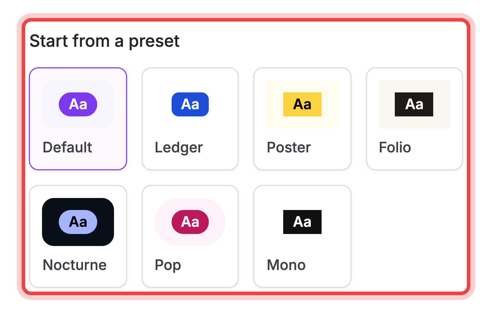
Changing any color, font, or shape control below switches the selection to Custom, since your form no longer matches a preset exactly.
Colors and typography#
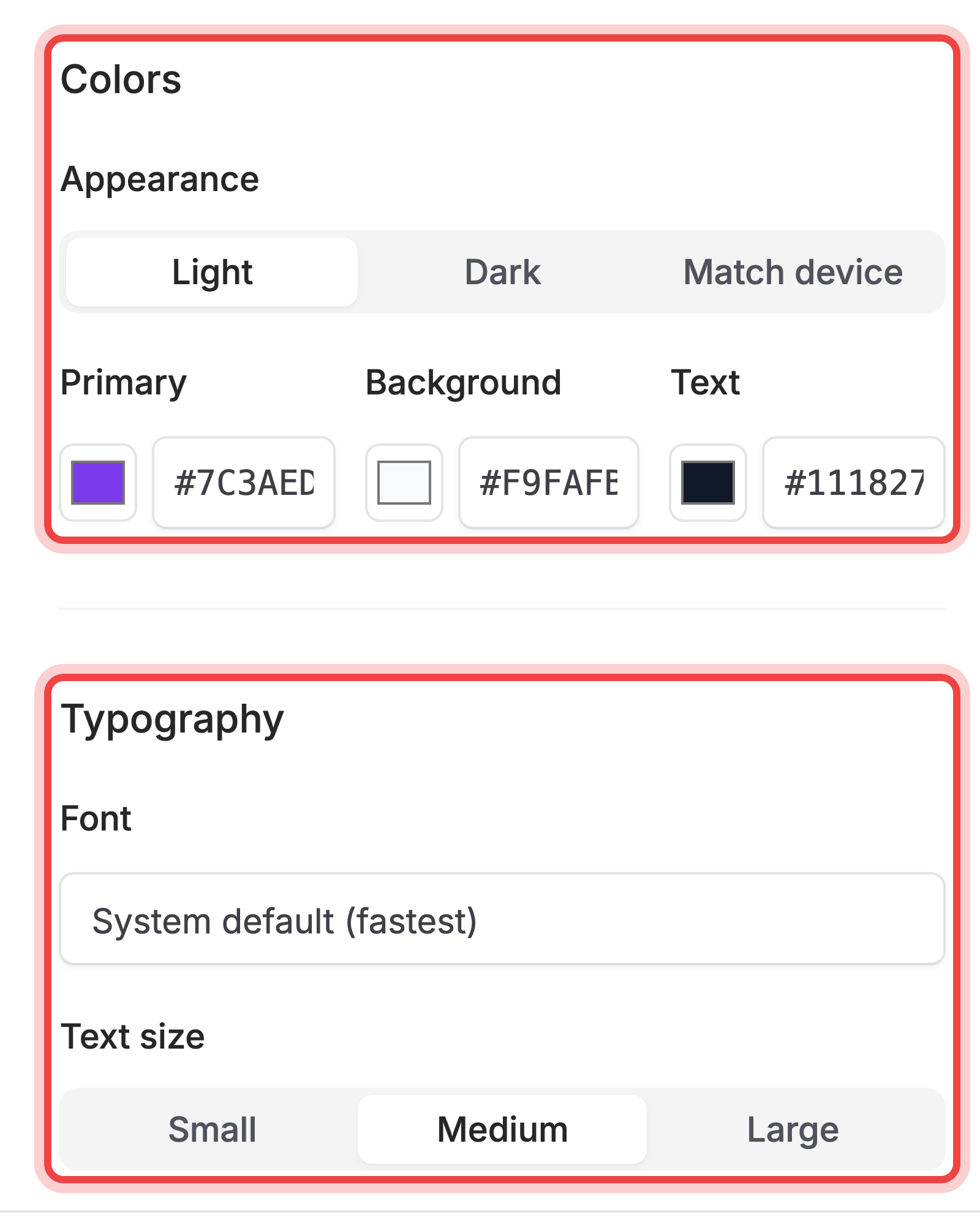
Under Colors, set Appearance to Light, Dark, or Match device, then pick Primary, Background, and Text colors with the color swatches or their hex fields.
Under Typography, type in the Font field to search Google-style web fonts, or leave it on System default (fastest). Text size sets the base size to Small, Medium, or Large.
Shape and layout#
Under Shape and layout:
- Corners sets how rounded fields and buttons are: Sharp, Slightly rounded, Rounded, Very rounded, or Pill.
- Form width sets the maximum width of the form: Narrow, Medium, Wide, or Full width.
- Spacing sets the gap between fields: Compact, Comfortable, or Spacious.
- Alignment sets whether the form sits Left or Center on the page.
- Form surface switches the form between Flat (blends into the page) and Card (sits on a raised panel).
Logo, cover and background images#
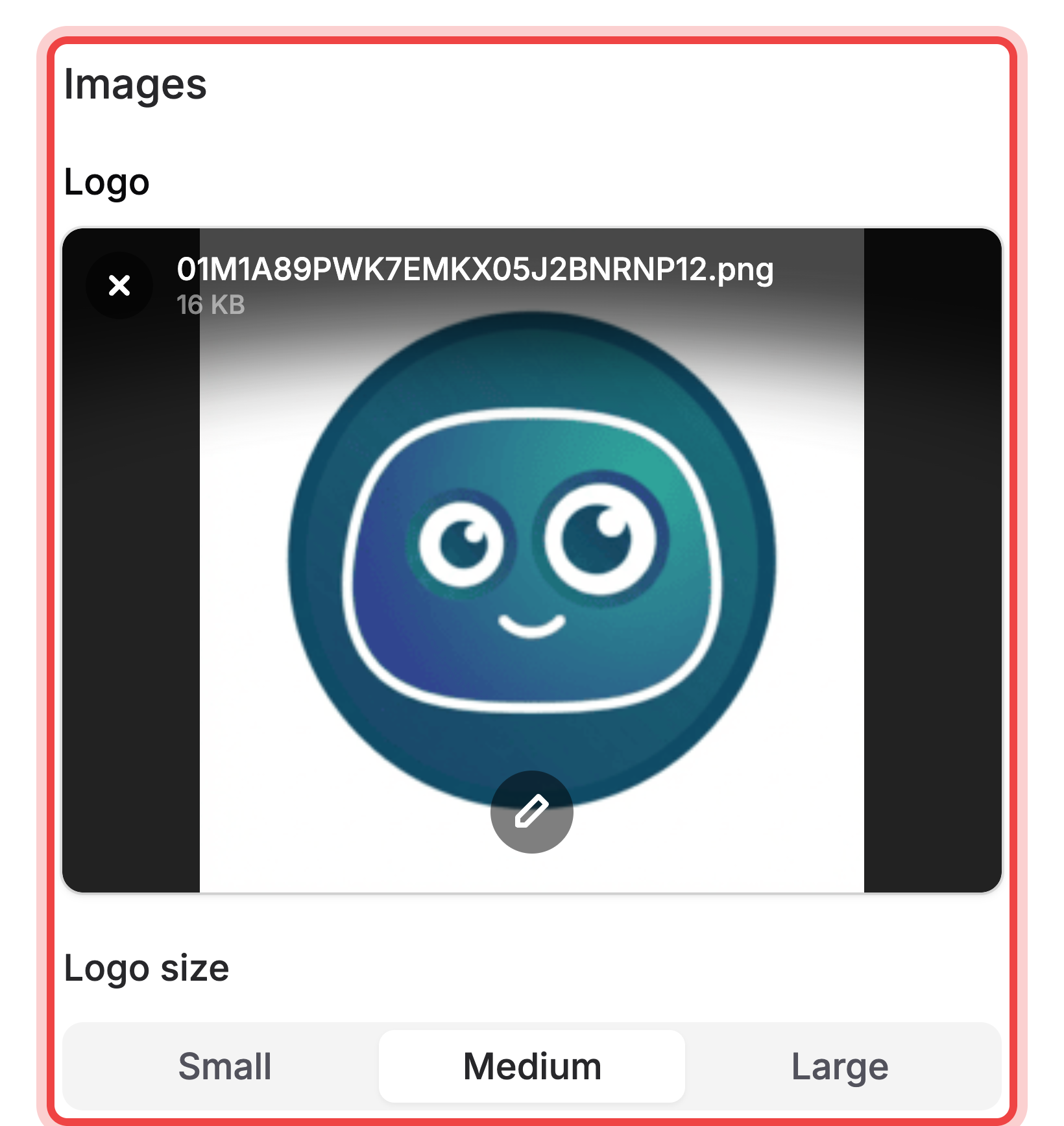
Under Images, upload up to three images:
- Logo shows above the form; set its size with Logo size (Small, Medium, Large).
- Cover image shows as a banner above the logo; set its height with Cover height (Small, Medium, Large).
- Background image fills the page behind the form; Background overlay darkens or lightens it (Much darker, Darker, None, Lighter, Much lighter) so your text still reads clearly.
Layout settings on the Settings tab#
The Form Layout setting lives on the form's Settings tab, not Design. Open Settings, and under Form experience set Form Layout to Stacked (labels above their fields) or Horizontal (labels beside their fields).
Remove Maxforms branding#
On plans that can hide it, switch off Maxforms branding under Form experience on the Settings tab; until you do, your public form shows "Made with Maxforms." See Plans and billing for which plans include this.
If the preview looks right but the live form does not, then save the design#
The preview updates as you make changes, but nothing reaches your public form until you select Save design. Reopen your form in a new tab to confirm.
If an image will not upload, then check the size and type#
Each image slot accepts different formats and sizes:
- Logo: PNG, JPEG, WebP, or SVG, up to 1 MB.
- Cover image: PNG, JPEG, or WebP, up to 3 MB.
- Background image: PNG, JPEG, or WebP, up to 4 MB.
A file outside these limits is rejected before it uploads. Resize or convert it, then try again.