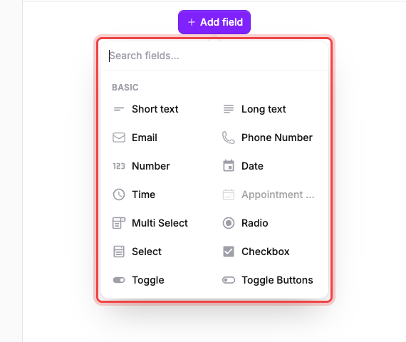
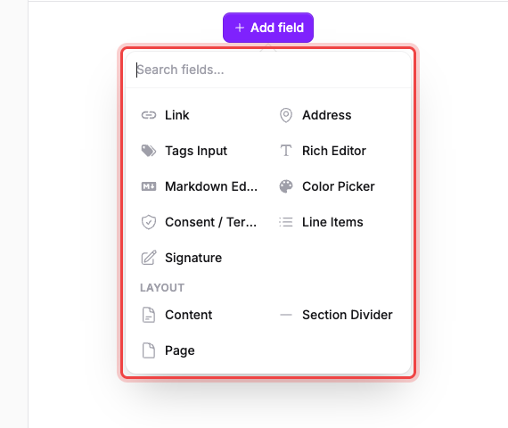
Select Add field in the builder to open the picker. Field types are grouped into Basic, Advanced, and Layout: use the Search fields… box at the top to jump straight to one by name.
Basic#
The everyday question types.
| Field | Collects | Good for |
|---|---|---|
| Short text | A single line of text. | Names, short answers. |
| Long text | A multi-line box for comments and descriptions. | Feedback, longer explanations. |
| An email address, checked for a valid, deliverable domain. | Contact details, confirmation emails. | |
| Phone Number | A phone number with a country dial code. You can restrict which countries are allowed and set the default. | Contact details, SMS follow-up. |
| Number | A numeric answer. | Quantities, ages, scores. |
| Date | A date. Turn on Include time to capture a time with it, and pick the Date format. | Deadlines, birthdays, appointment dates. |
| Time | A time of day, in the Time format you choose. | Preferred call times, shift start times. |
| Appointment Booking | A bookable appointment slot. Adding one turns on Services for your workspace. | Scheduling consultations or sessions. See Set your availability. |
| Multi Select | One or more options chosen from a dropdown. | Multiple interests, feature requests. |
| Radio | Exactly one option chosen from a visible list. | Single-choice questions, yes/no/maybe. |
| Select | One option chosen from a dropdown. | Long option lists, country pickers. |
| Checkbox | A single box ticked. | Opt-ins, agreeing to one condition. |
| Toggle | An on/off switch. | Enabling a feature, marking a preference. |
| Toggle Buttons | The same choice as a row of buttons instead of a dropdown. | Short option sets that benefit from being visible at a glance. |
| Checkbox List | One or more boxes ticked. | Multi-select surveys, feature lists. |
| Payment | Starts a supported payment workflow. A one-time Charge at submit payment completes before the response; Services also supports Stripe subscriptions and invoice-after-review. Greyed out until your workspace has a provider connected. | Collecting payment with a submission. See Connect Stripe and accept payments. |
| Hidden | A value passed in from the form's URL or embed parameters, never shown to respondents. | Tagging submissions with a campaign or account id. |
To make a payment optional, show the Payment field only when the customer chooses to pay, using conditional logic. See Choose your service setup before pairing Appointment Booking with a payment.
Advanced#
Richer inputs for when a text box isn't enough.
| Field | Collects | Good for |
|---|---|---|
| File Upload | One or more files, with a size cap and allowed file types you choose. | Resumes, photos, documents. See Collect file uploads. |
| Currency | A money amount in a currency you pick, shown as a symbol or a code. | Quotes, donations, prices. |
| Link | A web address. | Portfolio links, social profiles. |
| Address | A full postal address, split into street, city, state/region, and postal code. | Shipping, billing, event locations. See Address and currency fields. |
| Tags Input | A set of short free-text tags, typed one after another. | Skills, keywords. |
| Rich Editor | Formatted text with headings, bold, lists, and links. | Long-form answers that need formatting. |
| Markdown Editor | The same as Rich Editor, written in Markdown. | Technical or documentation-style answers. |
| Color Picker | A single color. | Brand color choices, design preferences. |
| Consent / Terms | Agreement to your Checkbox label, given by ticking a box. Show a document inline or through a link. Turn on Required to submit to make agreeing mandatory. | Terms acceptance, waivers. See Add consent, terms, or a waiver. |
| Repeatable Items | A repeatable table of rows. Pick a Template or define your own fields, then set Min Items and Max Items. | Orders, quotes, itemized lists. |
| Signature | A drawn or typed signature. | Contracts, waivers. See Collect signatures. |
There is no rating or matrix field; use Radio or Multi Select with numbered options.
Layout#
These don't ask a question, they shape the page.
| Field | Collects | Good for |
|---|---|---|
| Content | Nothing. Shows a block of text or images on the form. Include in submission documents decides whether it also appears on the submission PDF, notification email, and submission view. | On-page instructions, section intros. |
| Section Divider | Nothing. Shows a horizontal rule, optionally with a heading and some text under it. | Separating sections visually. |
| Page | Nothing. Splits the form into multiple pages, so respondents move through it with a Next button. | Long forms, reducing scroll fatigue. See Build a multi-page form. |
If a field type is greyed out#
Hover it and the picker tells you why. Payment reads Not available — connect a provider first. Everything else in the picker is available on every plan.
If you change a field's type later#
Open Advanced edit and use the Field Type dropdown.
Once the form has responses stored, the dropdown narrows to types that store their answers the same way, so switching can't strand the answers you've already collected. Before the first response arrives there's no such restriction: every type is offered, and converting between shapes (a Select to a Short text, say) discards the options you configured. Rebuild them if you switch back.